Hello NeXT community.
Recently, I did some internet research into the NeXT logo and Paul Rand himself. I came across the video showing Paul Rand, Steve Jobs and his team at the meeting where Paul was presenting his logo proposal to the NeXT team.
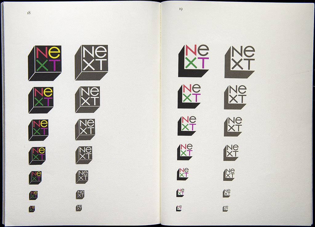
https://youtu.be/OUTxtvlyJDc It is evident in that video, that in the booklet, Paul Rand brought with him that time, the NeXT logo cube was straighten at pages 18-19. In contrary, there are copies of those booklets on the internet with this logo 28° tilted on these pages 18-19, as we know it today, along with the text explaining the reason and meaning of this angle.
https://jasminedavies.files.wordpress.com/2011/12/rit_archives_rand_01.jpg In the other hand, the picture of pages 18-19 with no angled logo, the same as seen in the video, is available online as well.
https://pbs.twimg.com/media/CXVgBcvW8AAKryu.jpg In the Steve Jobs biography, Walter Isaacson wrote that Paul Rand denied Steve's demand for brighter yellow color of letter "e" as a proof of Rand's approach not to modify anything. There is also 28° angle mentioned as the part of the original, final and the only Rand's proposal. It definitely contrasts with video mentioned above. My wondering is, if there are several claims, Paul Rand refused to discuss any changes or modifications of the only final proposal of the NeXT logo, when, where and how the 28° angled cube appeared. It had to probably be after the day, Paul Rand brought his brochures to the NeXT office for the first time.
Is there anyone out there aware of this issue who could clarify it for me or for us interested in?
Thanks in advance.
Have a great day.
Robert :roll:
Hello Robert: It looks like it was on the original envelope
of the presentation book only but Job's like it and it stuck.
https://cshaver.wordpress.com/2011/11/03/the-story-behind-paul-rands-next-logo/
Hello Rob.
It seems that there were two versions of the brochure. The first verson 1 was pictured in the official video of Paul Rand and Steve Jobs meeting.
However, the the final version 2 arose from this meeting. Version 2 was extended then on the page number 16 with the text describing the orientation of the logo. "Tipped at a jaunty angle, it brims with the informality, friendliness, and spontaneity of a Christmas seal and the authority of a rubber stamp."
This story was told differently by Walter Isaakson in the Steve Jobs' biography. In that story, Steve was given with the complete final borchure of the logo already inclined 28° contraclockwise. ...No word about angle changes proposed and even made. Walter Isaakson emphasized Paul Rand's relentlessness to make any aditional changes by describing the discusion over brighter yellow color of letter "e" in the word NeXT.
Concluded>
1- there are verion 1 and veriosn 2 of the Paul Rand's NeXT logo brochure. 2- The Steve Jobs biography is inaccurate in the jaunty angle issue.
What do you think?
Regards, Robert
Hello Robert: I think I may actually have one of these lol , it looks like it is a unicorn so let me search around . My guess is the Walter Isaacson version simply overlooked the original design. Did you know the competing design for a NeXT Cube was in the shape of a human head , who knows it may have led to robot cubes. My thought is I think the actual logo tilt may have been Hartmut Esslinger's designer of the NeXT Cube and monitor's and peripherals touch to offset the Cube shape. Perhaps the logo inspired the Cube shape as well we may be on to something!
Looks like the links in that Wordpress post are broken now, but thankfully The Internet Archive has a copy of the source he was referencing. Itself was quoting a publication called Design Dialogs that had an interview with Rand and his version of the logo angle story:
" The reason was, Jobs liked cutesy things. I believed that I should try to find some kind of object, like a cube. It seemed reasonable because Jobs indicated that his computer was going to be housed in a cube. He did not say, however, that I should use a cube--he just shot off a bunch of adjectives describing the machine.
thought, what's comparable to a cute little apple? A little cube-_something to play with.
And it was positioned askew on the envelope, like a Christmas seal.
Someone at the presentation meeting told me the thing that sold him on this logo was just that--the skewed logos--which is amusing because I originally did two versions.The first showed the logo parallel to the picture plane. The only one that was askew wasthe one on the back of the envelope. While the presentation was being printed, someone asked, "Why don't you do them all like they appear on the envelope?" I agreed. That
made it more playful and more lively."
https://web.archive.org/web/20120316072444/http://imprint.printmag.com/branding/paul-rand-steve-jobs/https://web.archive.org/web/20120316072444im_/http://imprint.printmag.com/wp-content/uploads/Picture-1.jpgSo it looks like at the meeting in the video Rand brought version with both the flat and angled logo. Interesting approach for someone who was so opposed to creating options.
I think by "envelope" Rand means the example envelope shown in the booklet on page 20 (not the envelope the booklet was in).
Rob, I know it's three years later, but if you do happen to have a version of the booklet of the with the non-angled logo I'd be interested in seeing if I could take it off your hands. :)
It's good that the logo book was digitized.
"Set in all capitals, the word NEXT is sometimes confused with EXIT, possibly because the EXT grouping is so dominant. A combination of capitals and lower case letters alleviates this problem."
Some things seem random but are very much not.